Summit Roasters
Minimalist
Type your cafe's name and our coffee shop logo maker shows it in every template here; edit the one you like for free. Or our AI can draw one from scratch, from a scribbled cat peeking over a cup to snowy mountains in a glossy 3D one.
20 designs, each set with your brand name. Open one to change its fonts, colors and layout. Editing is free; you pay only when you download.
The generator is set to Coffee Shop & Cafe. Type your name, pick a style, choose 2D or 3D, and the AI draws a logo from scratch. Your first AI logo design is free when you sign up.
Examples from our own library. Like a look? Use its style in the generator above.
Minimalist
Scribble
Whimsical
Minimalist
Minimalist
Minimalist
Minimalist
Minimalist
Minimalist
More looks in our logo ideas.
Most people meet a coffee shop logo on a cup, in somebody's hand, a few feet away. That cup is small and curved. On plenty of counters it's a plain white or kraft cup with a rubber stamp or a sticker on it, because fully printed cups usually come in large minimum orders. (Kraft is the brown, unbleached paper used for lots of cups and bags.)
So the logo has to work as one ink on paper before anything else. Then come the sleeve, the loyalty card, the bag of beans, the sign on the sidewalk, the menu board and a tiny round profile picture.
That list boils down to two questions. Does the logo survive in one color on brown paper? And can you still read it at the size of a thumbnail?
Walk down any main street and you'll see cups with wavy lines of steam, coffee beans and hearts poured in latte foam. They're popular for a reason: anyone gets them in half a second. The trouble is that they say “coffee”, not which coffee.
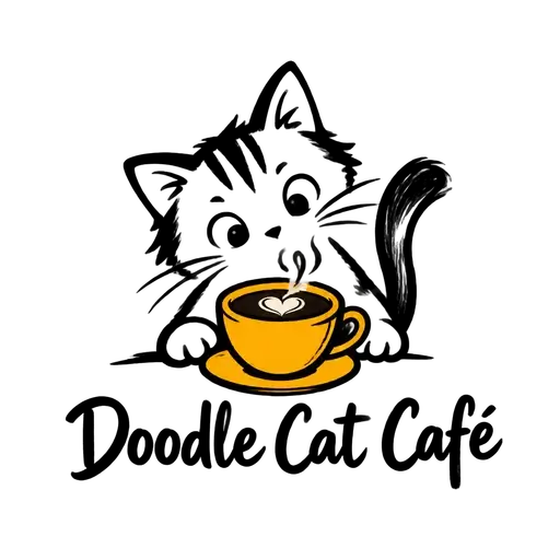
So keep the familiar shape and put something of yours in it, as two of our AI examples do. Summit Roasters is a glossy 3D cup holding snowy mountains, with steam rising above them. Doodle Cat Café is a curious cat peeking over a yellow cup, drawn in loose, scribbly ink. In both, the cup says coffee, and what you add to it says which cafe.
Our honest ranking: a cup with something of yours in it is the most dependable coffee idea there is. A bean on its own is the weakest, because shrunk to stamp size it's just a brown oval. Latte-art hearts look lovely in the cup and get lost on a sign.
Summit Roasters also shows the trade-off of a 3D logo: the gloss looks rich on screens and big signs, but on a rubber stamp it turns into a dark silhouette. Keep a flat version beside it. Our article on choosing between depth and a flat design goes through it.
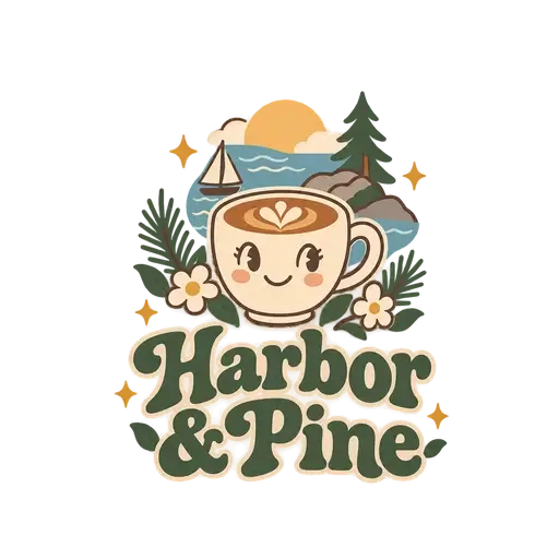
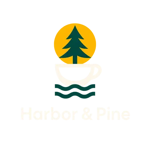
A cafe uses its logo in more shapes than most businesses, so plan the versions now rather than improvising when the sign maker calls. Our AI examples for an imaginary cafe, Harbor & Pine, show what a family can look like: a minimalist pine tree for dark backgrounds, a whimsical smiling latte cup, a glossy teal 3D cup carrying a sailboat, a black-and-white version and a horizontal one.
Each version has a job:
One thing to know: our AI draws a new design on every run, so the Harbor & Pine logos are siblings that share the pine and the cup, not one drawing recolored. For versions that match exactly, start from a template: its download includes black, white and on-background versions, and the symbol and the name on their own when the design has both. Or buy your favorite AI design as an SVG, open it in our editor and recolor it for each version.
The tone should match how people use the place. A specialty roastery selling single-origin beans (beans from one farm or region) tends to look quiet: plenty of space, simple lettering, one or two muted colors. A neighborhood cafe with brunch, dogs and a loyalty card can be warmer and sillier, like the Doodle Cat scribble.
Scripts deserve a warning. A flowing script name looks elegant painted on a window. On a small cup stamp, the thin joining strokes fill with ink and the name smudges. If you love a script, keep it big on the sign and pair it with simple capitals for the small versions.
Each template above already has your cafe's name in it. Choose by layout and symbol, then make the fonts, colors and spacing yours in the editor, free and with no account. Symbols can be recolored and moved but not redrawn, so if the one you want isn't here, type a keyword like “mountain” or “cat” into the search box of our logo templates.
Or describe your idea to our AI logo generator, something like “a coffee cup with a mountain inside”. For a family like Harbor & Pine's, switch the Color setting to Dark or B&W, and pick a wide ratio for the sign. Keep the rest of the brief the same and change one setting at a time.
Before you download, print the preview at its real size, cut it out and tape it to a cup. It tells you more than any zoom level. With the files downloaded, our free logo checker previews them as a tiny app icon and in one color, then on light, dark and colored backgrounds.
Only if your name doesn't say it already. Put the word on a smaller second line under the name, the way one of our AI examples sets “Coffee Roasters” under Harbor & Pine. “Coffee” suits a place built around the drinks and the beans, while “cafe” suggests food and somewhere to sit. Leave the extra line off the small versions, like the cup stamp and your profile picture, where every extra word shrinks the name.
Yes, if you make a stamp version. A rubber stamp prints one color, and ink spreads a little on paper, so thin lines run together and the small holes inside letters like “e” and “a” fill in. Use thick lines, drop the slogan and give the stamp maker your black version as an SVG or PDF file. A template logo's download already has black and white versions in both formats.
Dark ones. Kraft paper is a medium brown, so pale colors and coffee browns sink into it, while black, deep green or navy stand out. White can work too, but ask your printer for a sample on the same paper first. Before you order anything, try your colors on a photo of the actual cup. Our logo color guide has a quick contrast test you can do anywhere.
Window lettering is usually cut from sheets of colored vinyl, so it needs solid shapes and no more than two flat colors. Very thin lines and tiny text are hard to cut and tend to peel first, and a 3D or painted logo would need printed vinyl instead. Think about what's behind the glass, too: white lettering reads well against a dark interior, dark lettering against a bright one. Give the sign maker an SVG or a PDF.
Use the same logo, in a version that fits a label. Coffee bags often carry a round or square sticker, so a badge or a stacked layout fits better than a long horizontal one. Keep the origin, the roast date and the tasting notes on the label beside the logo, not inside it, so the logo looks the same on every bag. Print a test label and stick it on a real bag before a full run.
Browse all logo templates, use our free logo maker, or make a logo with depth in the 3D logo maker.