Logo checker8 min read
Transparent Logo PNG: Fix White Boxes and Rough Edges
Make a transparent logo PNG that works on your website. Check for white boxes, baked-in checkerboards and pale edges, then export the right file.
A transparent logo PNG should sit on your website without carrying a white rectangle around it. Yet a file can end in .png, look fine in a preview and still show a box when you put it on a colored header. The filename tells you which format you have. It doesn't tell you whether the background is actually transparent.
The quickest way to find the problem is to put the file on a color you know isn't inside the image. Then check its edges and the spaces between the letters. This guide walks through that test, explains what to fix in the original design and shows which files to use when you download from DepthLogo.
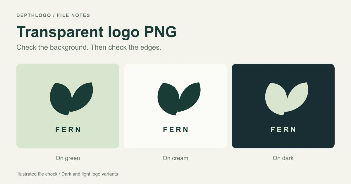
The diagrams use a simple leaf mark drawn for this guide, so you can compare the same shapes as the background changes.
How a transparent background works
Think of your logo as a shape cut out of paper. With a transparent background, the page behind it shows through around the shape and inside any holes. On a green website header, those empty areas look green. On a dark slide, they look dark.
An image can also be partly see-through. A soft shadow needs that: the shadow darkens the background without covering it completely. Along a curved edge, a narrow row of partly transparent pixels helps the curve look smooth instead of stepped. Designers call this smoothing anti-aliasing.
PNG can store this information as alpha, the amount of opacity associated with a pixel. That support is optional, as the PNG specification explains. Saving something as PNG doesn't require the image to contain any transparent areas.
That's why a white background and an empty background look identical on a white page. You need a different surface underneath to tell them apart.
Test the PNG on a colored background
Open a blank slide or a document in a design app. Give the page a strong color, then place your logo image on top. Change the page color, not the logo's opacity. A pale mint is useful for a dark logo; a deep blue makes a white rectangle hard to miss.
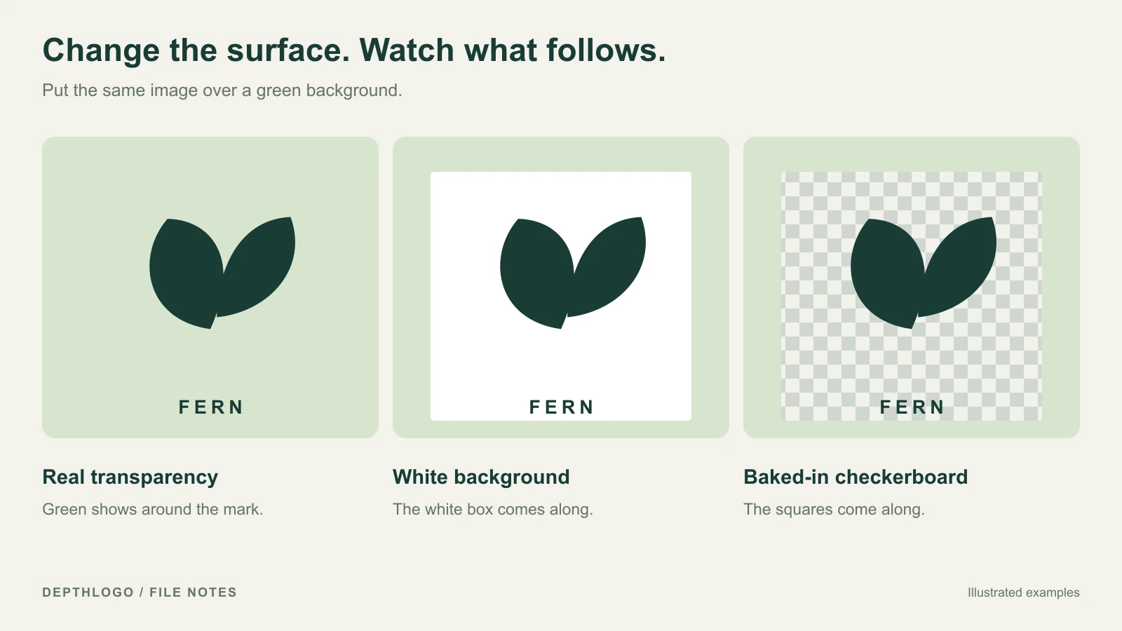
Look at the whole image first. If a rectangular white patch follows the logo around, that white is probably part of the file. If the page color reaches right up to the letters and symbol, the surrounding area is transparent.
Now look inside the artwork. The middle of an O, the gap in a handle and the space between two leaves should show whatever the design intends. Those gaps are easy to miss when you erase only the area outside the symbol.
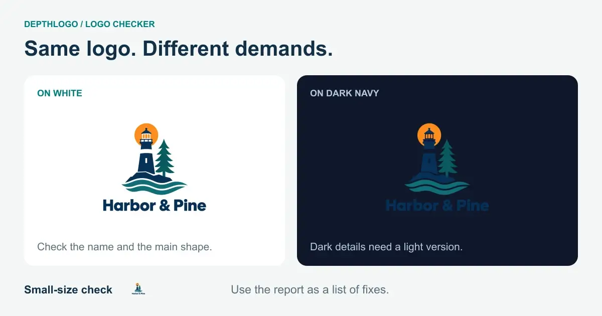
You can also open the file in our free logo checker. It reads the image in your browser and reports what it finds about transparency, file quality and how the logo holds up on light and dark backgrounds. Your own file is analyzed locally; it isn't sent to a server for this check. The checker helps you find problems and explains what to fix. To remove a background, make that change in the original design or an image editor.
Treat the transparency finding as a starting point. A file can have a transparent border and still contain an unwanted white patch in the middle. Look at the actual previews as well as the result label.
A checkerboard is a display convention
Many editors draw gray squares behind empty pixels so you can see where the image ends. Those squares belong to the editor's view. They shouldn't travel with the exported logo.
Sometimes an image contains a picture of those squares instead. It can happen when someone saves a preview or takes a screenshot of an editor. The result looks transparent until you put it somewhere else, and the checkerboard comes along too.
Use the same colored-page test. If the squares remain visible over green, they are pixels in the image. Go back to the original artwork or ask for a new export with a transparent background. Taking another screenshot will keep the problem.
Fix the source before you erase the background
If you have an editable design, start there. Look for a background layer, a page-color setting or a rectangle behind the artwork. Hide that background or choose a transparent export, then save a fresh PNG. The exact control depends on the editor, but working from the source preserves the edges of the actual logo.
Keep a copy of the design before deleting anything. A white shape might be part of the symbol rather than a backdrop. A white coffee cup on a colored badge needs to remain white, even if the area outside the badge should be empty.
When all you have is a flattened image, background removal is more delicate. A plain, solid mark on one even color is usually easier to separate than a pale watercolor symbol with a shadow. Similar colors make it hard to tell where the background stops and the artwork begins.
If you use a background-removal tool, inspect the result instead of accepting the first cutout. Check enclosed spaces, thin strokes and small text. Keep the unedited file so you can recover a detail that was removed by mistake.
For a simple symbol, returning to a vector source or rebuilding the shapes can save time compared with repairing a rough cutout pixel by pixel. For detailed artwork, ask whoever made it for the original transparent file. That's a reasonable request, and often the shortest route to a usable result.
A pale fringe needs a closer look
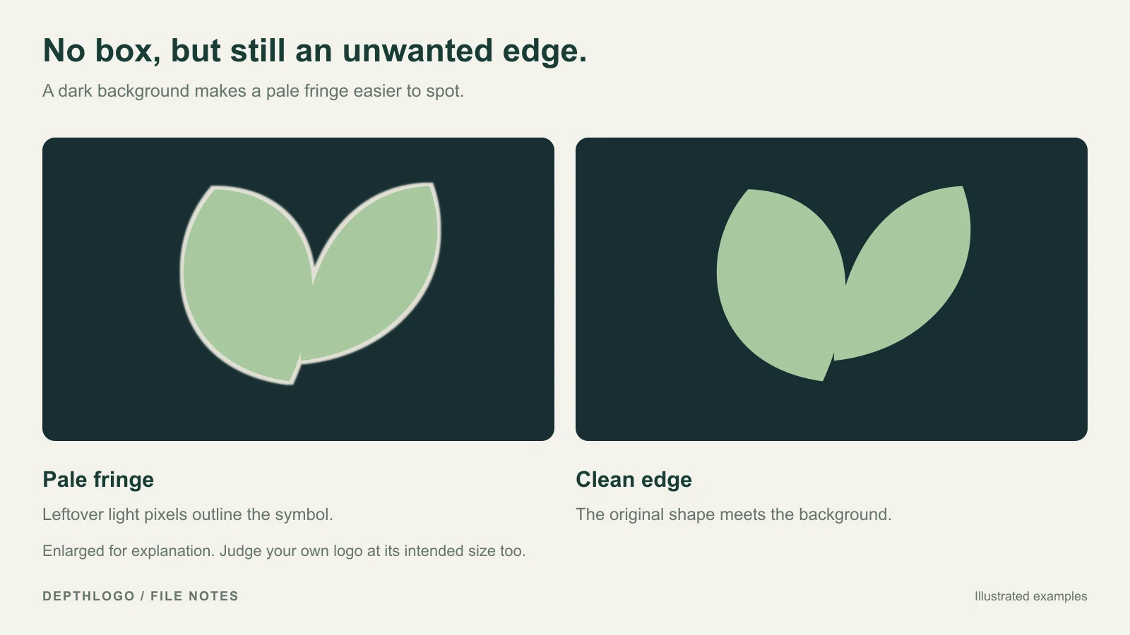
The rectangle can be gone while the edges still look wrong. A thin white or gray rim is especially noticeable on a dark background. It often comes from artwork that was flattened against white before the background was removed: some of that white remains mixed into the edge pixels.
Zoom in to find the fringe, then return to the size people will actually see. A dark website header is a useful place to judge it. If the logo looks outlined when the design has no outline, the edge needs attention.
Start by exporting again from the editable source with the background switched off. If the fringe is already baked into your only image, an image editor's edge-cleanup or matte-removal controls may help. Work on a copy and compare the result at normal size after each adjustment.
Don't remove every partly transparent pixel just to get a hard edge. Those pixels may be doing useful work around curves, fine lettering or a soft shadow. An aggressive cleanup can replace a pale rim with jagged edges or make thin letters look smaller.
If the edge is clean but the lettering disappears, you have a contrast problem. Removing more background won't solve that. Make a light version of the logo for dark surfaces, or use the logo on a background where its original colors remain readable. Our logo color guide explains how to plan those versions together.
Download the intended version from DepthLogo
When you start from our logo templates, the background you choose in the editor is useful for judging the design. The purchased download set includes a transparent version of the logo as well as a version with its background. You don't need to erase the editor's preview background yourself.
On the files page, choose the PNG for the version labeled Logo when you want the transparent template logo. With background is the version that carries the design's backdrop. Black and White versions give you other starting points when the original colors don't suit the surface beneath them.
Template editing and previewing are free. The clean files are part of the paid download. A screenshot of the preview keeps the watermark and captures the surface behind the artwork, so use the actual download when you're ready to put the logo on your site.
AI artwork needs a little more care. Some looks include a backdrop as part of the design. Neon, Watercolor and 3D Ice are examples where that background can belong to the effect. Don't assume every style produces an isolated symbol just because PNG is an available format. Read the style notes and inspect the result you plan to use.
An AI PNG is finished artwork. If you want to change separate shapes and colors in DepthLogo's editor, you need the SVG version. If you prefer direct control from the beginning, our logo maker lets you work from an editable template instead.
Keep transparency when you upload the file
Once you've checked the PNG, use that file in your website builder or document. Avoid passing it through a screenshot or saving a JPEG copy along the way. Standard JPEG doesn't preserve alpha transparency; PNG and WebP can, as MDN's image format guide describes.
If the original file passes your checks but a white box appears only on the website, look at the image block's settings. The block or its container may have a white background. Compare the same PNG in a blank colored slide before editing the artwork again. That small check can keep you from trying to fix the wrong thing.
Also check which file you uploaded. A download folder may contain the transparent logo, a version on its brand background and a square social image. They're different exports with different jobs, even when their small thumbnails look similar.
Keep the source SVG alongside the PNG if you have one. A PNG has a fixed number of pixels, so transparency won't stop it becoming soft when you stretch it too far. The SVG gives you a source for exporting another size. Our logo size guide covers how display size and file dimensions fit together.
Hand over a file someone else can use
Before you email the logo to a developer or drop it into a shared folder, give the file a descriptive name. For a dark green logo, fern-logo-green-transparent.png says more than final-final-2.png. Name the white version fern-logo-white-transparent.png. That makes the artwork's color clear without leaving someone to guess what “dark” means in a filename.
Add a short note about which background each version is intended for. You don't need a brand manual to prevent the most common mix-up: dark lettering placed on a dark page because it was the first file in the folder.
Then test the actual file you're handing over. Place it on a pale surface and a dark one, check the enclosed spaces, and look at it at the intended size. If you make another export after fixing an edge, repeat that quick check on the new file rather than relying on the older preview.
A useful transparent logo PNG keeps the artwork intact while letting the surface behind it show through. Once the background, edges and contrast behave as you expect, keep that checked file as your working copy. It saves the next person from having to guess whether the white they see is part of the logo or just the page behind it.