Orbit Labs
Minimalist
This tech logo maker sets your product's name in templates for startups, apps, SaaS and IT companies. Edit any of them free of charge, or ask our AI for an original mark to use from app icon to homepage.
174 designs, each set with your brand name. Open one to change its fonts, colors and layout. Editing is free; you pay only when you download.
The generator is set to Technology. Type your name, pick a style, choose 2D or 3D, and the AI draws a logo from scratch, once you've signed up and paid for it.
Examples from our own library. Like a look? Use its style in the generator above.
Minimalist
3D Ice
Minimalist
Minimalist
3D Ice
More looks in our logo ideas.
A tech logo is judged at its smallest. People see your favicon in a browser tab, your app icon on their phone and your avatar in a team chat far more often than the full logo on your homepage. Phones round off the corners of an app icon, and some crop it to a circle. A favicon is 16 or 32 pixels wide.
So design the mark first, a letter or a simple shape that survives at 32 pixels, and build the full logo around it. Two of our AI examples are app icons waiting to happen: Qwyzzle, a bold blue Q with a teal dot, and Northwind, a navy N cut by a sweeping blue wave. A ring like Orbit Labs' blue orbit with its teal moon holds up small too, as long as the line stays thick. Our downloads already include the favicon files and app icons, so once the mark works small, the sizes take care of themselves.
Plenty of tech names are invented words, often because the plain-word domain was taken long ago. A made-up name like Qwyzzle or Frostbyte has no picture to draw, so the logo usually comes from the letters: a lettermark, which turns one or two initials into a symbol, or a wordmark, the whole name set with care.
An invented name has to be spelled right after one look. Pick a plain, open typeface over anything stylized, and watch for letter pairs that merge when small: “rn” can pass for “m”, and “cl” for “d”. A lettermark, meanwhile, is just a letter until something about it is yours. Qwyzzle's teal dot does that job. If you look at letter-based templates, check which kind you've got: some set your own initial, but others draw a fixed letter as their symbol, and the editor can't change that one. No name yet? Our generator suggests names for free.
We made the three Minimalist examples on this page with the Colorful setting, naming no colors at all, and all three came out blue. (The two ice designs don't count: ice is blue anyway.) That's where a tech brief pulls, and plenty of the tech brands you already know went the same way.
Blue isn't wrong. It says “software” at a glance, which helps a new product look established. Next to ten blue competitors, though, it also makes you the eleventh. To stand out, enter up to three brand colors of your own in the AI generator, or recolor a template in the editor. Our logo color guide helps you pick them.
Whatever you choose, keep a flat version. A gradient looks polished on a launch page and falls apart on an embroidered hoodie or a one-color print, and startups give away a lot of hoodies.
Plenty of apps and websites offer a dark theme, so your logo will sit on near-black as well as on white. A navy wordmark like Northwind's would disappear on a dark header. Keep a light version. Template downloads come with one in white; for an AI design, buy the SVG and change its colors in our editor.
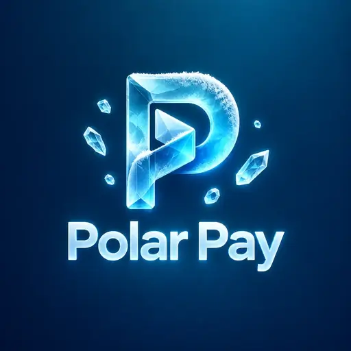
The 3D Ice style is worth a look for a launch. Polar Pay is a crystal-clear ice letter P, and Frostbyte a glowing ice-block F, both drawn on their own deep blue background, which suits a splash screen or a social banner. At favicon size the ice turns into a blue blur, so pair either one with a flat letter for small places. Our 3D logo maker shows the other styles with depth.
A software product lives on screens: the login page, the corner of the app, emails, a pitch deck. An app adds a store listing and a spot on the home screen. An IT services company lives on vans, business cards and invoices, and its customers want reliability more than novelty. Its name is often long, ending in Solutions or Systems, so let the initials handle the small spots and save the full name for the van.
Shields and locks turn up in plenty of tech templates, and they say security: right if you sell security, odd if you build design software. Circuit lines look technical on a big screen and turn to noise at small sizes.
Start from the templates above. Each one already carries your product's name, and you can edit as much as you like before paying for the files you keep. If you'd rather have a mark that's yours alone, our AI logo generator draws original designs; its Minimalist style made both Qwyzzle and Northwind. You sign up with your email or Google and pay once, before it's drawn.
Before you download, shrink the logo to browser-tab size and put it on a dark background. Then, with the files downloaded, run them through our free logo checker, which also flags gradients that will make printing harder. For other directions, browse our logo ideas.
Yes. Every download includes a favicon set, with favicon.ico, icons from 16 to 512 pixels and the Apple touch icon, plus square profile images for social accounts. A name can't be read at the small end of that range, which is why it pays to have a symbol or an initial that works at 32 pixels. For anything bigger, such as a store listing, an SVG lets you export PNG files up to 4,096 pixels wide.
Often, yes, especially with an invented name that has no obvious picture. A lettermark scales down well and makes a clean app icon. The catch is that plenty of startups share initials, so a plain letter is easy to forget. Give yours one detail of its own, like the teal dot on our Qwyzzle example, and keep the full name next to it wherever there's room.
Only if you plan for it. Dark mode turns your header near-black, so a navy or black logo needs a light partner. Keep a white version for dark screens and a dark one for light screens, and let your site switch between them the way it switches its other colors. Before you launch, run both through our logo checker, which shows how each holds up on light and dark backgrounds.
On screens it can look polished. The trouble starts off screen: embroidery, engraving, stamps and one-color prints need flat color, and a gradient has no obvious one-color version. If you love yours, use it on the website and in the app, and keep a flat two-color version for everything else. The logo checker flags gradients for exactly this reason.
Yes. Every logo you buy stays in My logos. Reopen a template logo in the editor to change its text, colors or layout, or an AI logo bought as an SVG to change its colors and move its parts, then download the new version at no extra cost. A PNG is finished artwork, so if you expect to keep tweaking after launch, start from a template or buy the SVG.
Browse all logo templates, use our free logo maker, or make a logo with depth in the 3D logo maker.