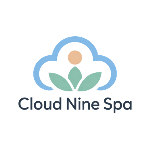
Cloud Nine Spa
Minimalist
Every template in this spa logo maker picks up your name; soften its colors and spacing in the editor for free. Our AI can also draw something calm from scratch, from a pastel cloud and lotus to folk-art tulips and birds.
88 designs, each set with your brand name. Open one to change its fonts, colors and layout. Editing is free; you pay only when you download.
The generator is set to Spa & Wellness. Type your name, pick a style, choose 2D or 3D, and the AI draws a logo from scratch, once you've signed up and paid for it.
Examples from our own library. Like a look? Use its style in the generator above.
Minimalist
Scandi Folk
More looks in our logo ideas.
Most spa logos reach for the same feeling: quiet, clean, a deep breath. The trouble starts when quiet turns into faint. Pale sage lettering in a thin font, with plenty of air around it, looks lovely on a mood board. Then it vanishes on a sign across a parking lot, on an embroidered robe or on a phone screen in sunlight.
The fix is to keep the softness in the colors and the symbol, and give the name enough weight to read. Cloud Nine Spa, one of our AI examples, works that way: a light blue cloud, a mint lotus and a peach sun carry the mood, and the name sits below them in gray. If your palette is pastel, let one darker tone do the reading.
Wellness has a handful of symbols every studio reaches for: the lotus, a stack of smooth stones, a leaf, a water drop, a figure in a yoga pose, two open hands. They aren't wrong. They say “wellness” in a second. They just say it for every studio on the street, and the thin-limbed yoga figure falls apart at icon size.
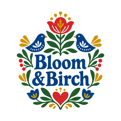
Something from your own place goes further: the birch outside your window, the hills you see from the treatment room, a flower that grows nearby, the pattern of the tiles in your steam room. Bloom & Birch, another of our AI examples, takes a different road entirely: symmetrical red tulips and blue birds drawn as Scandinavian folk art, warm and handmade and nothing like a lotus. For a spa that wants to feel cozy rather than clinical, that's a strong direction. You'll find more of our AI examples, sorted by style and industry, among our logo ideas.
The lotus isn't finished, though. Combined with something else, the way Cloud Nine pairs it with a cloud and a sun, it still works. A thin gold lotus on its own is the one people have seen too often to notice.
Type does a lot of the calming in a spa logo, and much of that comes from spacing. Letter spacing, which designers call tracking, is the gap between the letters. Capitals with generous spacing feel slow and expensive, while the same word squeezed tight feels busy. Be careful with lowercase: spread it out and the word falls apart into single letters.
Weight, meaning how thick the strokes are, matters as much. A light, elegant font works on a big sign and on your website, but at favicon size, or stitched into a towel, its strokes disappear. If you love a thin font, keep a bolder version of the name for small places.
As for the letters themselves, a soft serif (letters with small feet at the ends of their strokes) feels like a hotel spa, and a rounded sans-serif feels like a friendly neighborhood yoga studio. Neither is better. Pick the one your clients would expect.
Each kind of practice puts its logo in different places, so think about yours:
If one of the templates above already feels close, open it: your name is in it. Pick for the layout and the symbol, then adjust the colors and spacing until it feels calm without fading. Editing costs nothing, and you don't need an account. For a particular symbol, a wave or a sun, say, search our full set of logo templates by keyword, since the editor recolors and moves symbols but doesn't redraw them.
The AI logo generator here starts out set to Spa & Wellness. Cloud Nine came from the Minimalist style with the Light color theme, and the Pastel palette is worth a try too. Bloom & Birch is the Scandi Folk style. Watercolor gives a soft painted look, but it isn't flat vector art, so keep a flat logo alongside it for robes and stamps. Our guide on writing a brief for the AI helps with the “What should it show?” field.
Before you download, make the logo tiny on screen and check that the name still reads. Then set it on a dark color, the way it might sit on a website header or over a photo of your treatment room. After downloading, let our free logo checker do both tests; it also shows how the logo looks in a single color, which is worth seeing before you order embroidered robes.
Soft greens, sand, warm whites and pale blues are common because they feel calm, and they can still look like yours if you pair them well. What matters is contrast: keep one tone dark enough for the name, like a deep sage, slate or navy, and let the pastels color the symbol. Check the logo against white and against a dark photo. There's more on testing contrast in our guide to logo colors.
It can, but it's the obvious idea, and the thin arms and legs of a figure blur at small sizes. If you use one, choose a simple, solid figure rather than a fine line drawing, and shrink it to the size of the icon in a browser tab. You may do better with a well-set name and a symbol from somewhere else: the light in your room, the view, your street.
Yes, if the design is bold enough. Towels and terry robes are woven from little loops of cotton that swallow fine stitches, so hairlines, tiny text and soft gradients get lost. Embroiderers often lay a thin film over the fabric to keep the stitches on top, but a simple shape in one or two colors still works far better. Send them an SVG or a PDF and tell them how big the logo will be.
Not necessarily. Your name in a calm, readable font, with “Massage Therapy” on a smaller line beneath it, is often all a solo practice needs. A symbol earns its place in the small spots: your profile picture, the icon of your booking page, a stamp on your appointment cards. If you'd rather not have one, your initials can fill those spaces just as well.
It can be lovely, since soft edges and washes of color suit a spa's mood. The catch is that watercolor is painted texture, not flat shapes, so it won't stitch onto a robe, press into foil or print cleanly in one color. Use it where it shows large and in full color, like your website, gift vouchers and printed signs, and keep a simple flat version for everything else.
Browse all logo templates, use our free logo maker, or make a logo with depth in the 3D logo maker.