AI logo generator11 min read
Logo Styles: How to Pick One in an AI Logo Generator
All 14 logo styles in our AI logo generator, each with a real logo: what every style is good at, where it struggles and how it changes your files.
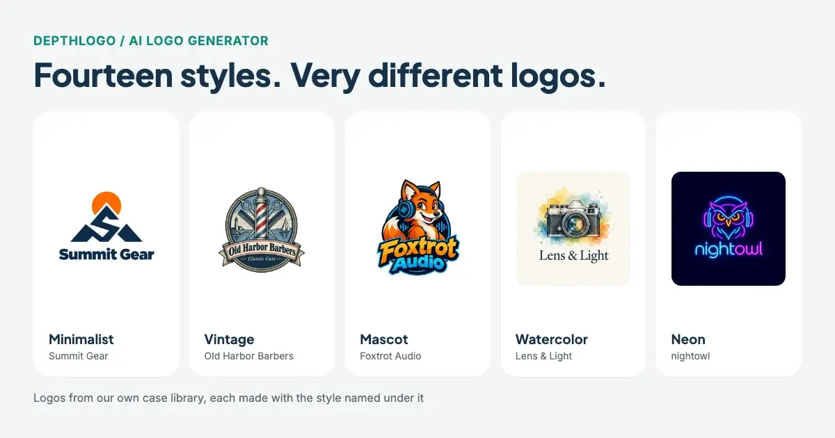
Most people who open an AI logo generator type their name, glance at the row of styles and press the button. Fair enough, there's a lot on that screen. But of everything in the brief, the style changes your logo the most. It decides what kind of symbol you get, the lettering, whether the logo looks flat or sculpted, and even what the files can do once you've downloaded them. Below we go through all 14 logo styles in our generator, each with a real logo from our case library, and say plainly where each one is at home and where it gets you into trouble.
One thing to know up front: you can buy any style as a PNG, an SVG or both. The style never locks you out of a file. It does change what's inside the SVG, though, and that matters more than people expect, so there's a section on it near the end.
What a style actually changes
In our generator a style isn't a filter laid over a finished picture. Each one is a written set of instructions for the image model: what sort of symbol to draw, how heavy the lines are, what lettering goes with it, how many colors to use. That's why the same name in Minimalist and in Mascot comes back looking like the work of two different studios.
Many styles also have a palette of their own. You get it when the colors are left on Colorful. Choose a palette or enter your own colors and those take its place, so the colors in the examples are only a starting point.
A few styles bring their own background too. Watercolor is painted on off-white paper, Neon glows on a dark night-toned background, and 3D Ice sits on a deep navy-to-teal gradient. A glow or a block of ice needs something behind it, or it doesn't read. Every other style comes out on a transparent background, so it drops straight onto a website or a photo.
Then there's depth. Most styles let you pick 2D or 3D. Four of them, Retro 3D, Gold, 3D Ice and 3D Clay, are always 3D, and the switch doesn't apply to them.
Minimalist: one shape and a clean name
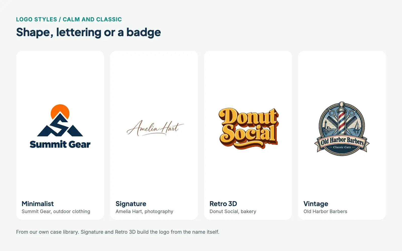
Minimalist asks for one strong, simple symbol, clean modern lettering and two or three colors at most. The aim is a logo that reads at app-icon size and on a billboard. Summit Gear, an outdoor clothing brand in our library, shows it well: a navy mountain that also forms an S, under an orange sun. One shape doing two jobs.
If you're stuck, this is the style we'd start with. It prints in one color without a fight and still looks like a logo at 32 pixels. It also leaves your photos and packaging free to carry the personality.
The catch is that minimal logos live or die on the idea. Give the generator a vague brief and you get a tidy shape that could belong to anyone, like a swoosh or a leaf. Tell it one concrete thing to show, like "a mountain shaped like the letter S" or "a paper plane folded from a receipt", and the result gets far more specific.
When the name is the logo: Signature and Retro 3D
These two are built from your name. Neither invents a symbol unless you ask for one, and even then it stays small, a supporting detail next to the lettering. With the description field left empty, you get the name plus one small touch at most, such as a swash, a star or an underline.
Signature writes your name as a fluid, handwritten signature with a single flourish. Amelia Hart, a photography studio in our case library, came out as flowing brown handwriting with a long underline. It suits anyone who sells under their own name: photographers, coaches, stylists, people who make things by hand. Two warnings, though. Thin pen lines fade fast at small sizes, so check it as a profile picture before you fall for it. And long names get cramped, so if people know you by your first name, try that on its own.
Retro 3D does the opposite. It takes chunky, high-contrast serif letters and pushes them out into deep 3D blocks with a solid side, in a warm 1970s poster palette of mustard, burnt orange, cream and chocolate brown. Donut Social, a bakery, is the style at its best. It's loud and friendly, and great for a donut shop or a record store.
Retro 3D is also the style that's already selected when you first open our generator, so some people end up with it without ever choosing it. It's a fun style. It just isn't right for a dental practice or an accounting firm, so if that's you, change it before anything else.
Vintage badges
Vintage draws a seal or shield with fine engraved lines, an illustrated symbol in the middle and your name around the border or across a ribbon, in two to four muted colors. Old Harbor Barbers is a classic case: a striped barber pole with crossed scissors and combs over a little harbor scene, and a "Classic Cuts" ribbon underneath.
Barbers, breweries, garages, coffee roasters and outdoor outfitters all wear this look well. It says "we've been doing this a while", even if you opened last month.
The weak spot is detail. Those fine engraved lines fill in when the badge shrinks, and text that runs around a circle gets tiny very quickly. If you go vintage, plan a second, simpler version for the small places. Often that's just the symbol from the middle of the badge.
Characters people remember: Mascot, Whimsical and 3D Clay
These three put a character at the center. Mascot and 3D Clay go further: they always draw one, even if your brief doesn't say what it should be.
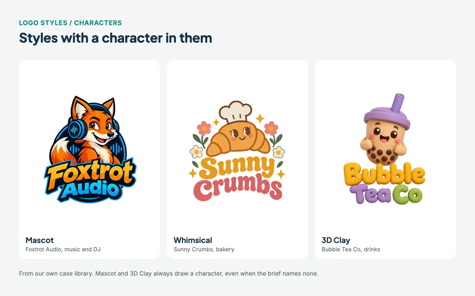
Mascot is the bold cartoon look you see on esports teams and sports bars. It draws an expressive character with thick outlines and cel shading (flat blocks of light and shadow, like in a comic), usually in a lively pose, with chunky display lettering. Our Foxtrot Audio logo is a grinning fox in blue headphones inside a ring of sound waves.
Whimsical is softer. It builds a cute character or object from rounded shapes, frames it with little flowers, stars or sparkles, and pairs it with bouncy vintage lettering in muted pastels. Sunny Crumbs, a bakery, got a smiling croissant in a chef's hat.
3D Clay sculpts a chunky character out of smooth matte clay, with puffy 3D letters under it and soft studio lighting. Bubble Tea Co's logo is a happy bubble tea cup with a purple lid. It's hard to look at without smiling, which is the point.
A character makes a brand easy to remember and easy to like. Kids' brands, cafés, pet shops, games and food trucks get a lot out of one. There are two downsides. A face turns into a smudge at favicon size, so you'll want a simpler mark for the tiny places. And a mascot sets a tone that's hard to undo: if you sell to careful corporate buyers, a cartoon fox may not be the first impression you want.
Whichever you pick, be specific in the brief. "An animal" gets you a random animal. "A fox wearing headphones" gets you Foxtrot Audio.
The hand-made look
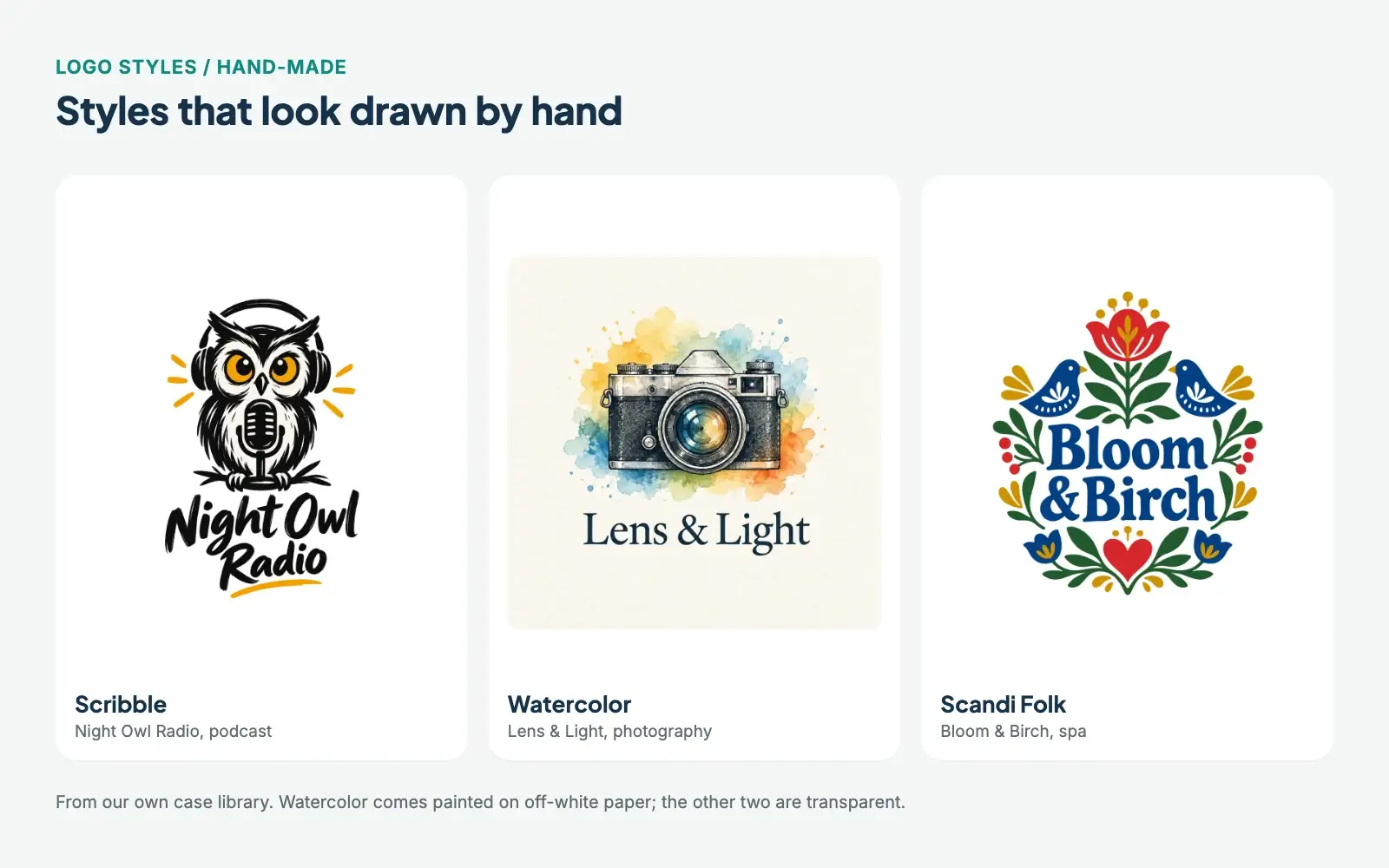
Scribble draws the symbol in loose, energetic black ink with slightly wobbly edges and adds one bright accent color. Night Owl Radio, a podcast, became an inky owl in headphones behind a microphone, with orange touches. Because it's mostly black line work, it copes with one-color printing better than you'd guess, which makes it a good fit for stickers and stamps.
Watercolor layers a detailed ink sketch over loose, bleeding washes of paint, with clean lettering below, all on off-white paper. Lens & Light, a photography studio, got a vintage camera over soft blue and orange washes. It looks lovely on a menu or a wedding website. The texture is the whole charm, though, and texture is the first thing to go in one color or at small sizes. Before you choose it, ask whether the logo has to go on anything that can't show soft color, like embroidery or a rubber stamp.
Scandi Folk uses symmetrical, flat motifs (tulips, leaves, birds, hearts) in red, cobalt, mustard and leaf green, with friendly hand-cut lettering. Bloom & Birch, a spa, has red tulips and blue birds wrapped around navy lettering. The shapes are flat and bold, so it prints well on packaging and fabric, and the symmetry gives it a calm, settled feel.
Made for screens: Neon, Pixel, Gold and 3D Ice
These four look best on a phone or a monitor, and each needs a bit of thought before it goes on paper.
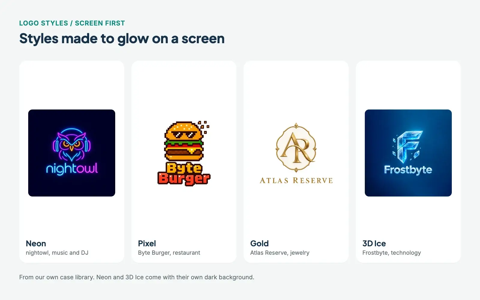
Neon draws the symbol and the name as bent glass tubes in saturated colors with a soft glow, on a dark background. Our nightowl logo for a music brand is a purple owl in blue headphones over glowing blue letters. It's made for bars, DJs, streamers and anything that happens after dark. The glow is part of the picture, so on a white invoice or a paper cup there's no real light to make it work. Keep the dark background, or plan a plain version.
Pixel builds the symbol on a visible grid of square pixels with a small 8-bit palette and blocky lettering, with no blur at all. Byte Burger got an 8-bit burger in sunglasses. It's obviously right for games and arcades, but it's also more practical than it looks: pixel art is made of flat squares of color, so it survives being shrunk better than most styles here.
Gold turns your initials into an interlocked monogram in embossed gold foil, inside a thin ornamental frame, with your name underneath in widely spaced serif letters. Atlas Reserve, a jewelry brand, came out as an embossed gold AR. It's at home with jewelers, fashion labels, hotels and wine. One practical point: the gold you see is a picture of gold. If you want real foil on your business cards, the printer will need flat shapes to stamp, so keep a one-color version of the logo handy.
3D Ice carves the logo from translucent ice and frosted glass, with crisp refractions and a cool blue glow, on a deep blue background. Frostbyte, a tech company, has an ice-block F with frost shards. It's striking in a feed or on a launch page, and a good match for anything cold or crisp. Like Neon, it's a picture of a material, so think about where else the logo has to go.
How the style changes your files
This is the part people forget about, and it's the one that bites later.
A PNG is a picture made of pixels. Every style works as a PNG, including the 3D ones, Watercolor and Neon, and it's what you'll use on your website and social profiles.
An SVG is a vector file. It stores shapes instead of pixels, so it stays sharp at any size, and it's what sign makers and embroiderers ask for. You can open your SVG in our editor, change the colors or the text as often as you like, and download it again.
Here's where the style comes in. For flat styles like Minimalist, Scandi Folk or Pixel, the SVG is made of clean, simple shapes that are easy to recolor. For the painted, glassy, clay and glowing looks (Watercolor, 3D Ice, 3D Clay, Neon and Gold) the SVG is a detailed trace of the artwork. It still scales without blurring, but it's built from a great many small shapes. That's fine for a big print or a banner. It's hard going for anyone who has to cut the logo from vinyl or stitch it, and it's fiddly to edit.
So if you already know the logo will be embroidered on shirts or cut out as vinyl lettering for a van, pick a flat style from the start. If it will live mostly on screens, choose whatever you like.
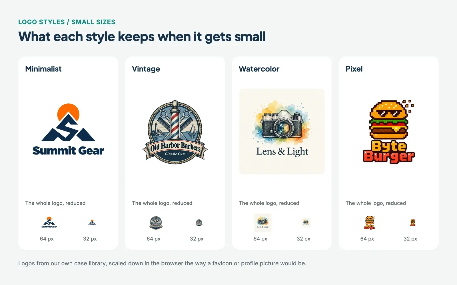
Size is the other half of it. The picture below shows four styles at full size and then shrunk to 64 and 32 pixels, the size of a favicon or a small profile picture. The Minimalist mountain is still a mountain. The vintage badge becomes a gray coin, and the watercolor camera turns into a pale smudge. Pixel holds on longer than you'd think.
None of this rules out the detailed styles. It's normal to have a detailed badge on the shop window and a simple symbol everywhere small. You just need to know from the start that you'll want both.
How we'd choose
Start with where the logo will spend most of its life. If that's a browser tab or an embroidered polo shirt, lean toward Minimalist, Pixel or Scandi Folk. If it's a shop front, a menu, a bottle label or a social feed, the detailed and 3D styles have room to show off.
Then think about how you talk to your customers. A children's clothing label can carry a clay character; a family law practice probably can't. A craft brewery can wear a vintage badge with a straight face, while a cybersecurity startup in Watercolor will raise a few eyebrows. None of this is a rule, but if a style feels like a costume on your business, it probably is.
It's also worth settling the style before you press Generate. Each design is paid for before the AI draws it, so choose with care. The style picker shows a real logo made with every style, which is the quickest way to compare them. Look through those, imagine your own name in each, and keep the one or two that fit.
And if you're stuck between two, pick the plainer one. It's much easier to add character later, with photos and packaging, than to take it out of a logo people already know.